It appears from discussion at Wikipedia that the catchphrase “lies, damned lies and statistics” is in fact unattributed. That’s a shame, because it’s a pretty important idea – statistics are very slippery, and in this time of COVID-19 I’m seeing how easily they can be misunderstood, and misused.
There is a lot of attention being paid to the two core numbers around this pandemic – the number of cases, and the number of deaths. There are a lot of graphs showing up with various trend lines projected forward, but there’s very little awareness that these apparent sources of truth are in fact hiding a lot of biases, fudges, agendas, and plain inaccuracies, while still being based on cold hard numbers.
I’ve looked for the sources of these numbers, or at least the published sources, and for the UK there are two prime sources:
I’ve drawn the data for the graphs below from DHCS via ArcGIS because that organisation is focussed on the numbers that relate directly to their operational activity. The ONS numbers are a lot more complex, and quite different to the DHCS numbers, because they are not in the business of tracking daily changes. When this is all over and done though, their post-hoc analyses will be (as usual) incredibly insightful and useful.
At the time of writing, DHCS are being criticised because their numbers are probably an understatement – the deaths/day numbers will almost definitely be higher as people are passing away in their homes and in care centres that are not included in that number. Similarly, the cases/day numbers could be significantly under the reality, as the number of people being tested is a small subset of the population. Statistics are not easy. Context is everything.
I knocked up some graphs today that I think show how misleading graphs can be if they are not understood, starting with cases/day and cases. Wow! Scary graph! the big line is shooting up! That’s ok though, the cases/day is only climbing slowly. Right?

I think this graph is a good illustration that people in general are bad at grasping how small increases in cases/day can sky rocket the cumulative number of cases. I’m seeing a lot of graphs that just show the cumulative number of cases, which makes for a very scary curve, but also hides the real thing to be concerned about, which is that the underlying cases/day is increasing more or less linearly.

Using a logarithmic scale rather than a linear scale is another interesting trick. Oh look! the numbers are flattening out! That’s good right? This makes things look a lot more hopeful, but the easily missed truth here is that the rate of increase in cases/day appears to be flattening out. That is very different to saying the cases/day is flattening out.

Another trick is to use a column graph instead of a line graph. It emphasises the variation in cases/day – hey look, we had some days not as bad as others – while making it more difficult to see the trend in the numbers (which remains that the number of cases/day is still increasing each day)

I’ve seen a few uses of logarithmic scales with column charts. Don’t do that, it conveys almost nothing useful.
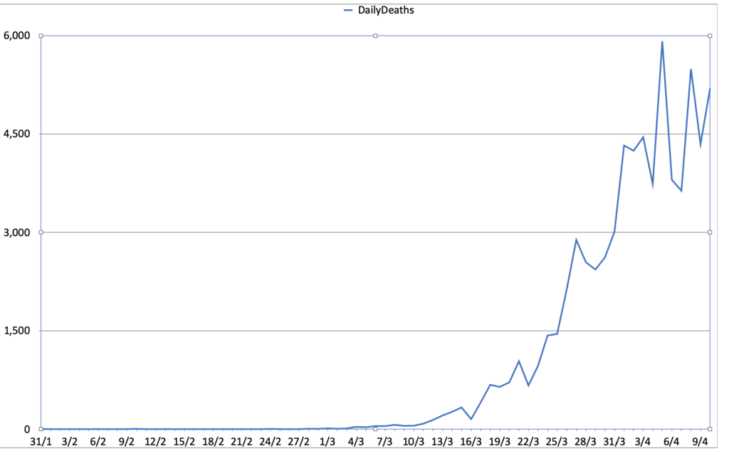
This is the grim graph. The deaths/day is unambiguously racing upward, and the variation in recent days is very scary – if you want to look for a canary in the NHS coalmine that shows they are nearing the limits of what they can do, it’s that signifier.
And this is the even more grim graph. The numbers/day is increasing, and the rate of increase is increasing. This shows up even better on a log scale

Again, this is a quite unambiguous graph – which is probably why we are not seeing it in the media – the rate of increase in deaths/day may be flattening out, or may still be linear. Not the number of deaths/day, but the increase in that number day on day. People are very bad at thinking about numbers.

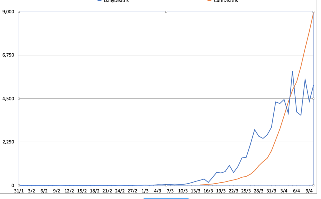
Putting them all together on a linear scale is not incredibly useful, although it does suggest that the relationship between cases and deaths is becoming more hopeful – with the caveat that the numbers of both are likely to be under-reported at this time. We are only going to fully know the shape of this pandemic after the fact.

leaving out the giant curve of cumulative numbers makes it a little easier to see the shape of daily numbers. It looks at first glance that the rate of increase of deaths/day is lower than the rate of increase in cases/day, but we need to look at the log scale to get a better idea:

I like to think that this gives the clearest idea of what is happening, but it is the one that requires the most interpretation. The shape of the two curves is roughly the same. What does that mean? That the rate of change day-on-day is about the same, and tracking similarly.
I know this is quite rambling, and I want to emphasise that I am not an epidemiologist or a statistician. I only want to highlight that the same data can be painted in many different ways, and that different representations can reveal or conceal useful information and knowledge. There’s a big difference between facts and the interpretation of facts, and when facts are presented via graphs, we do well to question why a particular representation has been chosen.
Post a Comment